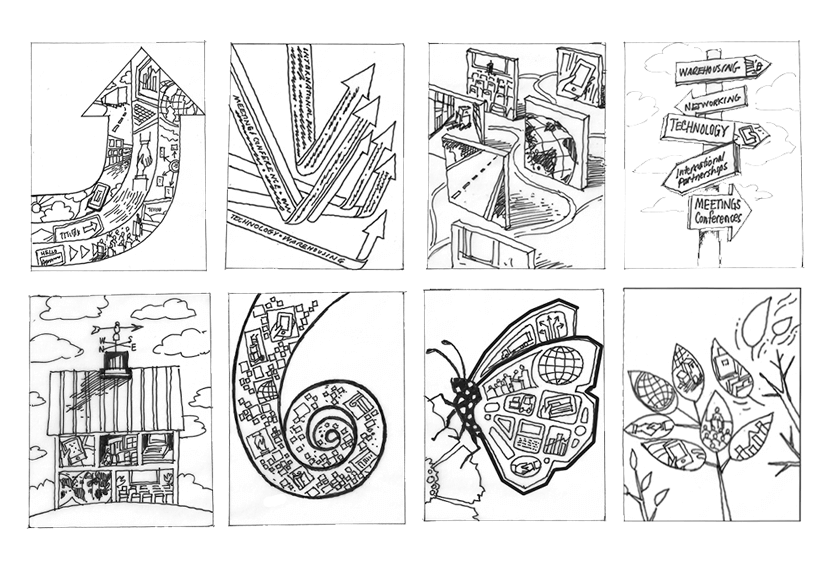
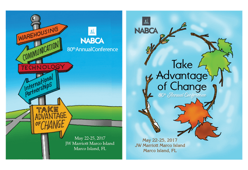
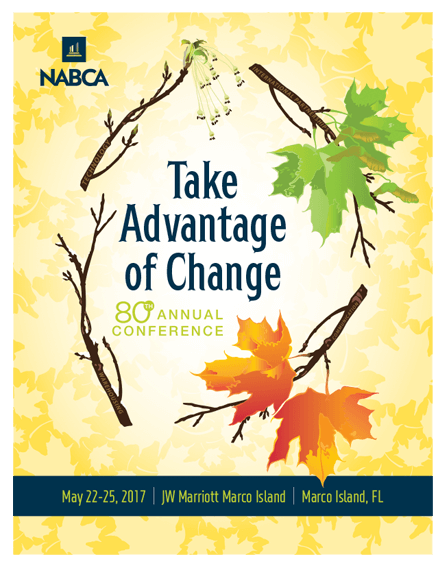
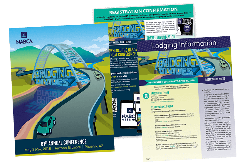
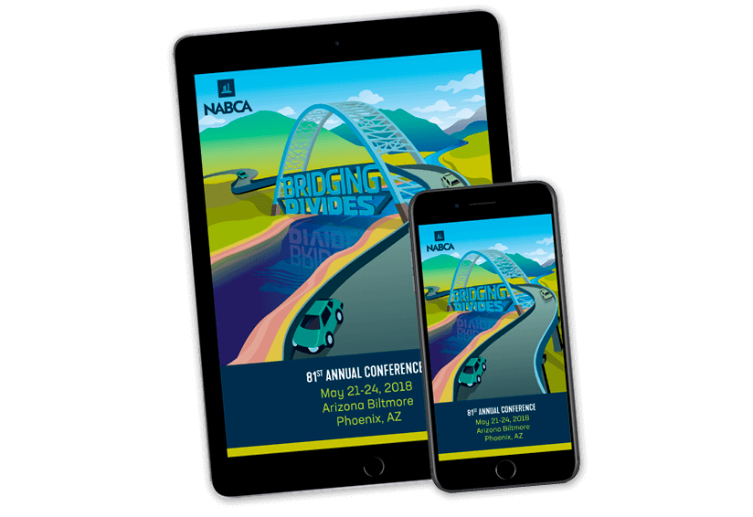
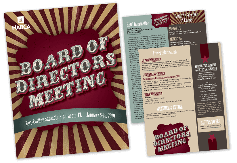
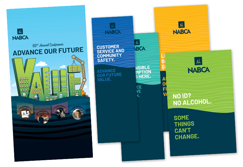
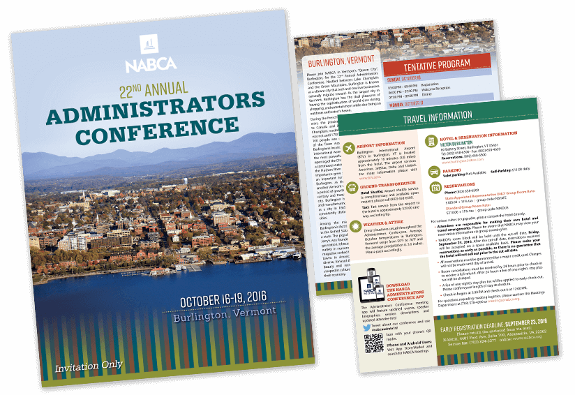
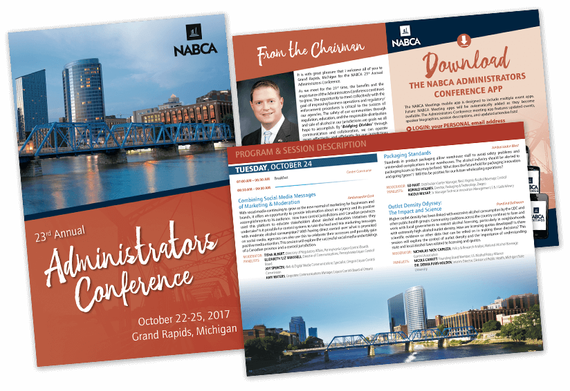
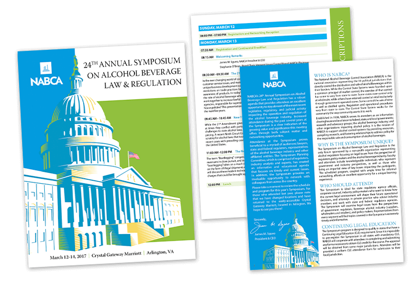
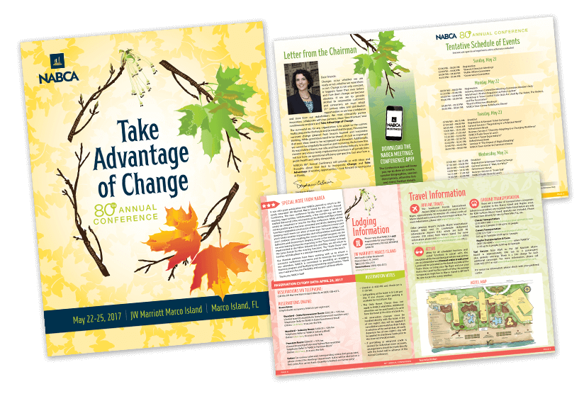
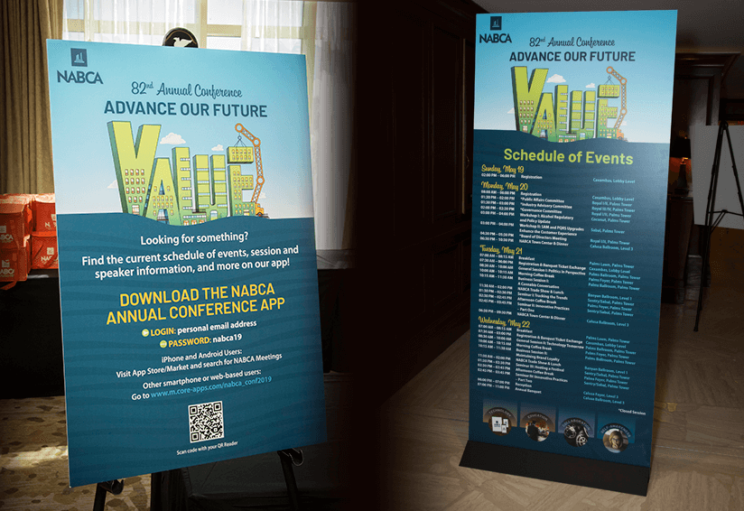
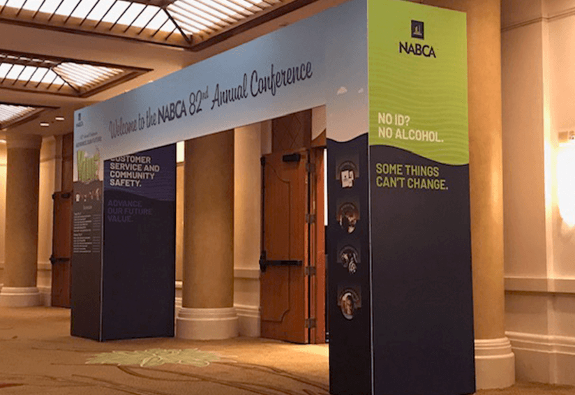
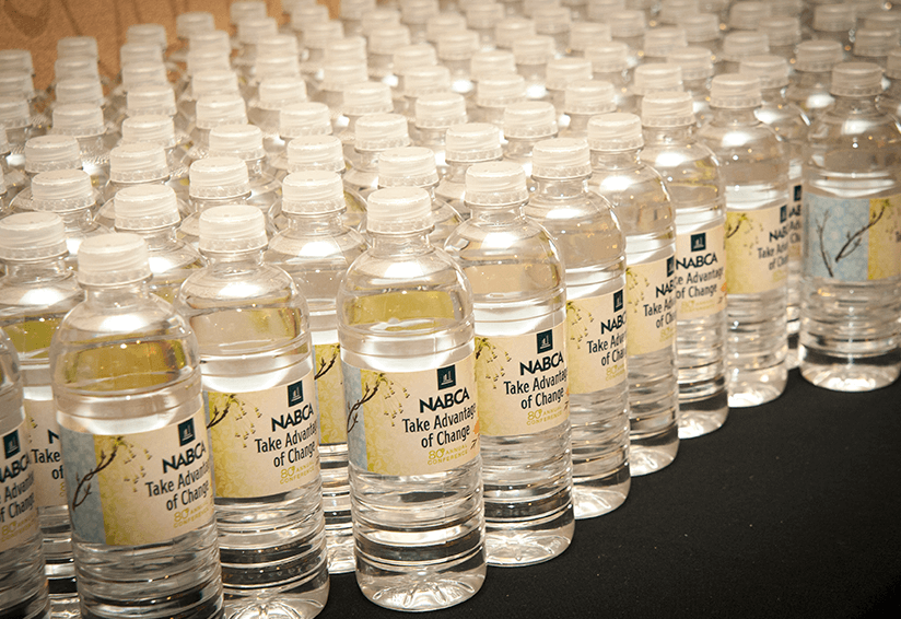
The custom illustrative concept gave NABCA’s annual conference a strong visual brand during the life cycle of the event through planning until deployment. The theme was used consistently on all of the event’s sales, marketing and on-site collateral, which tied the conference together with a cohesive look and feel.
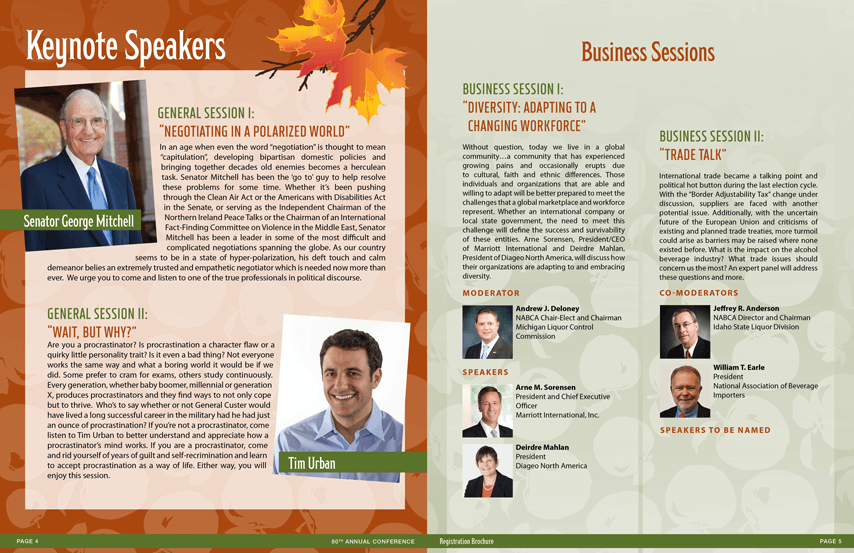
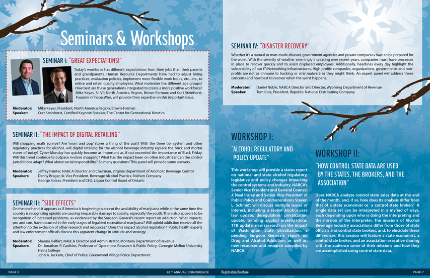
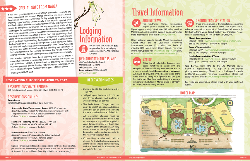
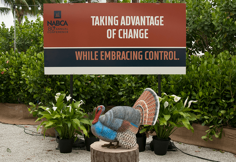
While the predominant color scheme for much of the marketing material was “summer yellow,” other seasonal colors and creative elements were developed to distinguish different sections of the marketing materials, such as a fall color scheme for keynote speakers; a winter scheme for seminars and workshops; and spring scheme for lodging and travel information. These complementary graphics added variety to the collateral, while also tying together the seasonal concept in a creative way.
