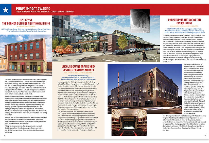
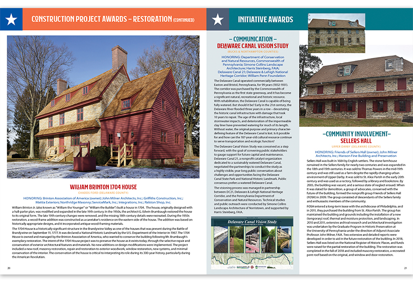
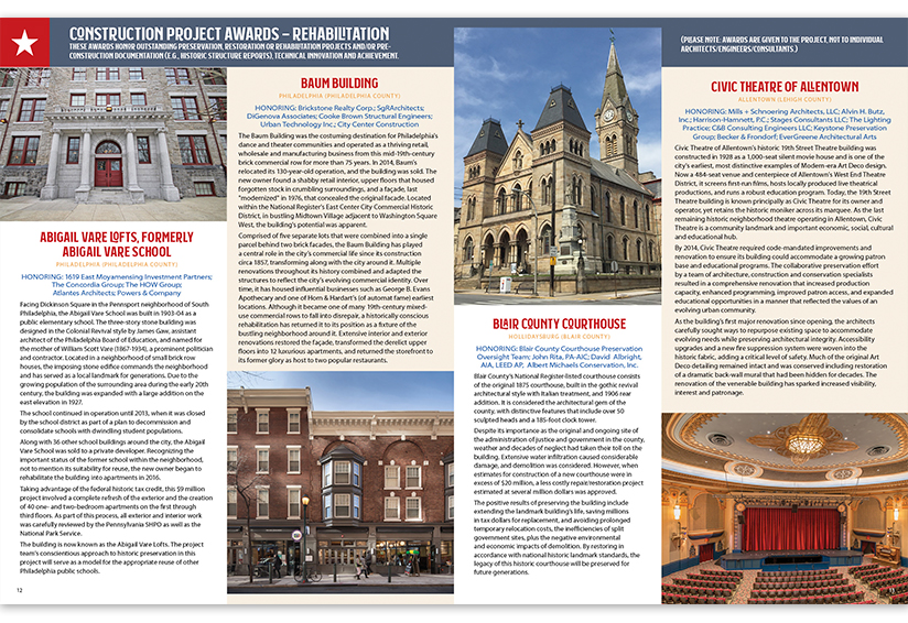
Often, a document’s cover is featured front and center when creative folks like me share work samples. But most of the time, the inside page spreads contain the real “meat” of the design. Taking assets from a client and giving them structure, order, readability and creative cohesiveness is also where all the hard work lies. Usually, images are different sizes, text blocks vary in length … it certainly is a creative challenge at times, to make all the content fit and look good without using 6-point type and postage-size images.

I recently completed Preservation Pennsylvania’s annual awards publication, and I particularly love the way the two-page spreads came out. This year, I was able to use larger images, thanks in part to the addition of four text pages that allowed me to feature the beautiful images the award recipients submitted. Award groupings have different color headers to separate the sections, and tints behind text help separate the award recipients. Each spread is a little different but still retains a cohesive look.

There are endless possibilities when it comes to page layout. I love digging in and seeing where the page will take me. Brand, target market, media and end use all drive the initial direction. Toss in a bit of intuition and a boatload of experience, and inevitably, a little magic happens, too.


