Sharing statistics with your audience and stakeholders, in communication materials such as annual reports, doesn’t need to be dry or boring. From picking an engaging color palette to showcasing your statistics in a new, fun or creative way, there are lots of ways to bring life to your numbers. The annual report I designed for Freedom School Partners is such an example.
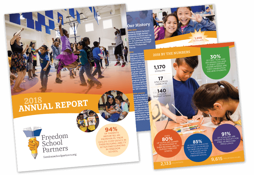
The final piece was a six-pager (think large trifold). That particular size and layout presented the information in an impactful linear way, but also kept production costs down since no stapling was necessary to keep pages together in a booklet format. If you have less information or a smaller press run (500 or less), shrink the size to fit on a digital press sheet, which is usually about 18″ wide x 12″ tall – a 6″ x 6″ square page size would be interesting, depending on the amount of content you want to include.
You can also use images to break up content, whether it’s photography you have, purchased stock imagery, or perhaps a little illustration … people like to look at pictures (hello, Instagram®), so if it’s appropriate, include some. Or maybe your information can be presented as an infographic that’s printed on a poster.
The possibilities are endless, or as endless as your budget. But with some creative planning, you can celebrate your stats in myriad ways.