Inspiration for creative concepts can come from a variety of places. Take Sarasota, Florida, for example. When the last Ringling brother decided to move the winter quarters of Ringling Bros. and Barnum & Bailey Circus from Bridgeport, Connecticut, to Sarasota, it helped the town prosper and grow (you can read more here at Ringling.org). Ninety years later, it also inspired the graphic theme for NABCA’s 2019 board meeting, which would be held in this historical town.
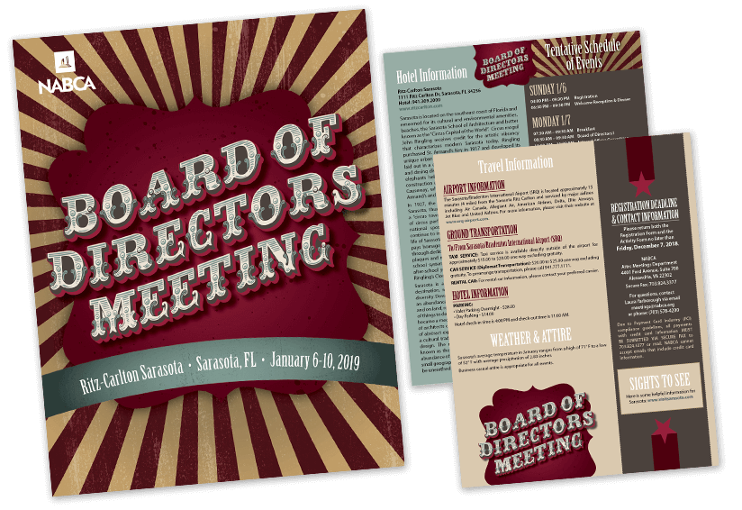
The client didn’t want an overly circus-themed design, however. So rather than feature tents and trapeze artists, I focused on the graphic nature of traditional tent fabric with its striking red and white stripes, then gave it a sophisticated vintage color palette and added textures.
I also used a font made up of different layers – such as accents, shadows and fills. Each layer can be colored separately until just the right combination is found. This gave us a great circus-style feel for the name of the event customized to the client’s liking. But a layered font isn’t practical for using everywhere in the design, so I chose a complementary font to use for headlines. I also treated recurring design elements in different ways to help make all of the pieces cohesive.
Where’s the location of your next event? Perhaps its history can inspire your marketing theme. Building on a great concept takes flexible design elements, a strong color palette, and appropriate fonts. With a skilled designer, it shouldn’t turn into a circus!