Beyond Circles: A Smarter Take on Brand Icon Design
When it came to designing my new website, I had a decision to make. Actually … I had a lot of decisions to make.
But one revolved around icons.
You know the ones – those familiar little graphics that typically show up in circles next to service words like marketing, technology, banking or consulting.
People use them for good reason. They offer a visual cue and break up text, so your services page doesn’t become one big wall of words. They make things more skimmable.
They’re fine. But they’re everywhere. And none of them felt like us.
What if, instead of icons, each service had its own mascot?
A character. Something thoughtful. Specific. A little unexpected. A visual that actually said something about how we work.
It started as a spark of an idea. But as the site and brand developed, the mascots became part of the process – and the personality.
How Our Brand Icon Design Turned Into Mascots
Once the idea of mascots sparked, the next step was figuring out who they’d be. There were lots of directions I could’ve gone: nature, the cosmos, abstract symbols.
But in the end, creatures felt right.
They live in different environments, show different strengths and mirror the variety in the services we provide.
So I thought about what kind of traits each service needed to represent and picked an animal that fit.
Each of Sharper Creative’s core services plays a different role in building a brand. The mascots reflect that – and bring a little warmth and character to what could have been a very buttoned-up design system.
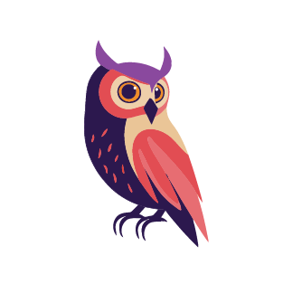
Hazel the Owl
Wise and thoughtful, Hazel represents the strategic thinking that happens before design ever begins.
She champions Brand Strategy:
Clear positioning
Audience alignment
Messaging that actually makes people care
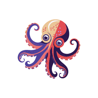
Coral the Octopus
Clever and creative, Coral lives for flexibility and smart design thinking that brings a brand identity to life.
She loves Brand Design:
Cohesive visual systems
Attention to detail
Designs that look great and work hard
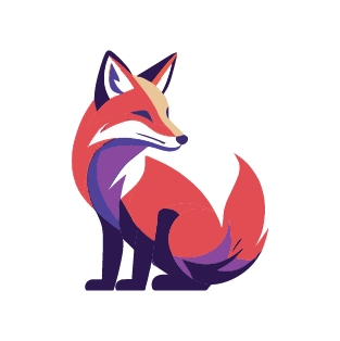
Amber the Fox
Sleek, smart and strategic, Amber’s here for branded tools that do the heavy lifting.
She cheerleads Collateral Design:
On-brand materials that support your goals
Thoughtful layout and messaging
Marketing pieces that feel like part of a system
Betty the Bee
Organized and high-energy, Betty’s hive-minded and knows how to rally the crowd and make your event unforgettable.
She rallies Event Graphics:
Wayfinding and signage that’s easy to follow
Visual cohesion across large events
A branded experience that makes people feel like they’re part of something bigger
Why did we choose mascots?
Because icons are everywhere. Mascots are a little more fun.
They’re memorable. They make people smile.
They give a glimpse into how we think and what we value.
They add personality to what could’ve easily been forgettable.
And most importantly, because they set us apart – which is exactly what strong brand design should do.
Now that they’re developed, I’m excited to see where they wander next.
Our Balanced Approach to Brand Icon Design
While mascots anchor our service areas, we didn’t want to overdo it.
Mascots are memorable, but traditional brand icon design still has a valuable place. That’s why we also used more straightforward, custom-designed icons throughout the site to support key content in other ways.
Here’s how we approached it:
For our Brand Design page, we created an icon set to visually represent key elements of brand identity – things like typography, logo design, imagery, layout and more. These were tied together with a subtle underwater theme (to keep Coral company), while remaining functional and easy to scan.
Brand Strategy Services Page
We also designed icons to represent the foundational components of a brand: Your story. Your edge. Your voice. Your foundation.
These custom icons are color-coded and aligned to our brand’s overall look and feel. They give visual structure to our Brand Strategy page without stealing the show.
General Site Use
Finally, we designed a simple four-point star derived from one of the circle icons above. Used in various brand colors across the website. These aren’t meant to be flashy – their purpose is to make the content more readable and engaging.
Why visual consistency matters
Whether you’re using traditional brand icon design, mascots or both – visual consistency builds trust.
When your icons, colors and elements hang together visually, your audience doesn’t have to work as hard to “get it.” You look more polished, professional and intentional.
Where to use custom brand icons
Icons don’t need to live only on your services.
You can build recognition and connection by also using them in a few unexpected places, including:
Your homepage
Email footers or newsletter sections
Proposals and presentations
Digital downloads or PDFs
Infographics and data visuals
When done well, custom icons add polish, reinforce your message and give your brand a cohesive feel.
— Featured Project —
Grudi’s Custom Brand Icon Design
Grudi, a tech company serving telecom and IT clients, came to us looking for more visual consistency across its services.
Here’s what we built:
Top-level icon sets for Managed Mobility, Managed Telecom and Managed IT
Color-coded service icons for Mobility, Phones, Data, Cloud, Security and Consulting
Two variations (with and without background) using a dotted circular style
Functional icon sets for sub-services like Help Desk, Device Lifecycle and Reporting
Illustrated team avatars to add personality without relying on stock photography
Below is a sampling of the icons we created for Grudi. You can visit their website to see them in action.
The result? A cohesive, clear visual system that reinforces their expertise across channels. Below is just a sampling of the icons we created for Grudi. Read the case study.
Want to Rethink Your Own Icons?
If you’re rebranding or refreshing a site, don’t just reach for the standard stuff. Try this:
Think metaphorically. If your service was a creature, shape or symbol, what would it be?
ChatGPT can help. Ask it for metaphors or icon suggestions based on your services. Just make sure you’re the one making the final decision.
Make it your own. If you must use a common symbol like a lightbulb, make it yours. Color it, simplify it or combine it with another symbol.
Stock icons can work. You can start with stock icons, but make them better. Buy vector versions so they’re scalable and tweakable.
Use simple shapes. Diamonds, squares or stylized shapes can represent your services without saying too much.
Tie it to your logo. Can an element of your logo act as an icon on its own?
Keep your color palette consistent. Custom icons don’t need to be flashy, but they should feel cohesive with the rest of your design.
Or save yourself time and energy by hiring an expert to handle your brand icon design for you.
Custom icons don’t need to be flashy, but they should feel cohesive with the rest of your design.
Mascots might not be right for every brand. But thoughtful brand icon design? That’s always worth the effort.
This website uses cookies to ensure you get the best experience on our website. If you continue to use this site we will assume that you are happy with it.