This website uses cookies to ensure you get the best experience on our website. If you continue to use this site we will assume that you are happy with it.
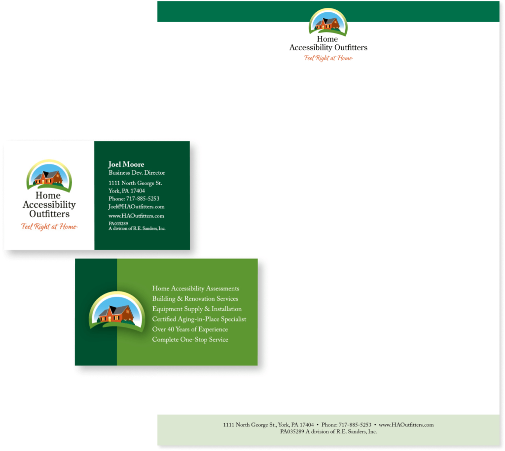
Joel Moore
Business Development Director
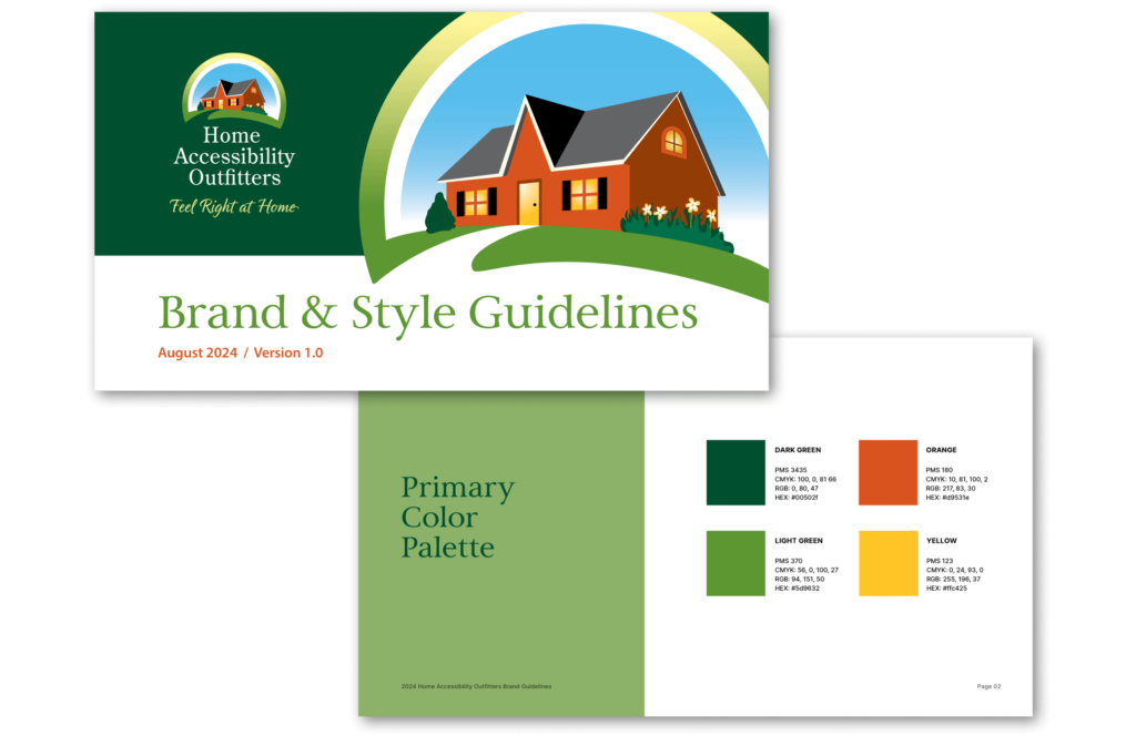
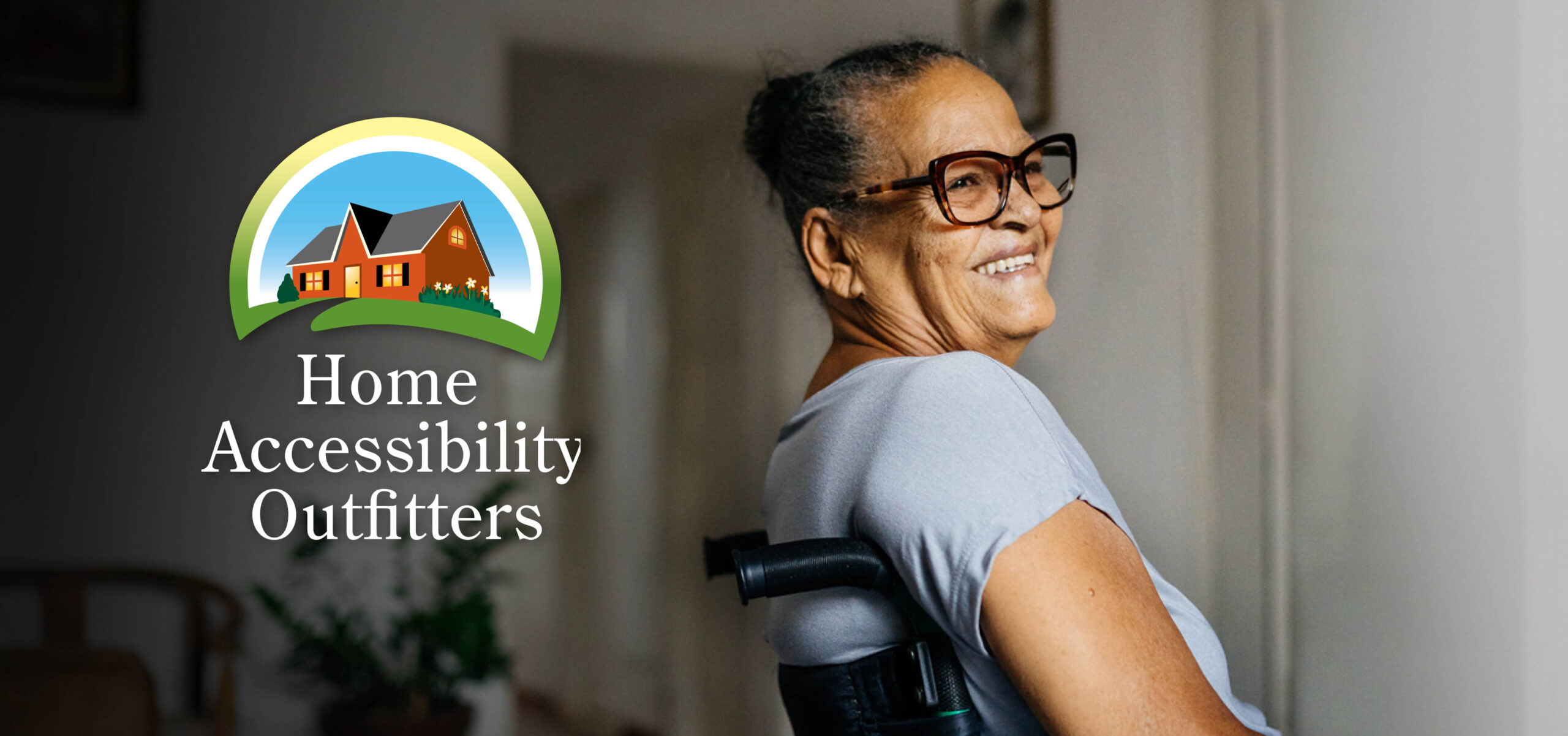
Home Accessibility Outfitters