
The Challenge
For decades, Grudi Associates achieved continuously growing sales and success in the communications technologies industry with their current logo, identity and messaging. In recent years, however, the changing market, technologies and customer preferences had become less consistent with the company’s presentation of itself. This was making it increasingly difficult for Grudi Associates to attract new prospects and customers.
In addition, the COVID-19 pandemic also dramatically changed the way customers were willing to interact with companies like Grudi Associates. It became much harder to “get in the door” without its traditional face-to-face approach. The branding and messaging that adequately supported in-person prospecting was much less effective at drawing contacts online, which was essentially the only way to reach people during COVID.
Grudi Associates’ positioning was as a leading supplier of virtually any Telecom & IT services a business could want. The focus was on a comprehensive menu of specific services, which potential customers would have to assimilate and determine which to inquire about, proactively. With the rapidly and exponentially increasing quantity of services being provided by Grudi Associates, prospects were being overwhelmed. Many would not or could not invest the time and resources to engage.
In summary, the brand, identity and messaging had become marginally effective in today’s market.
The Need
- An in-depth review and analysis of Grudi Associates’ positioning, brand, identity, messaging and communication materials.
- A more effective way of talking about what Grudi Associates does, that tells prospects how it provides value and helps businesses to succeed, rather than delivering a list of options.
- Renaming the company. Grudi Associates sounds low tech and more like a law firm than a cutting-edge communications technology firm.
- A new brand that effectively, accurately and concisely reflects who Grudi Associates is and how it can help businesses succeed in a way today’s decision makers can relate to.
- A new logo that would convey a fresh, high-tech, contemporary image of Grudi Associates, consistent with the new brand.
- Updated communications materials, beginning with a new website and DRIP campaign, to share Grudi Associates’ refreshed brand and messaging.
The Success
Sharper Creative dove in and ignited a transformation of how Grudi Associates reached out to and presented itself to the market. Key components included:
- Transitioned from long lists of available services to three specific offerings that address customer needs in a compelling way: Managed Mobility, Managed Telecom and Managed IT.
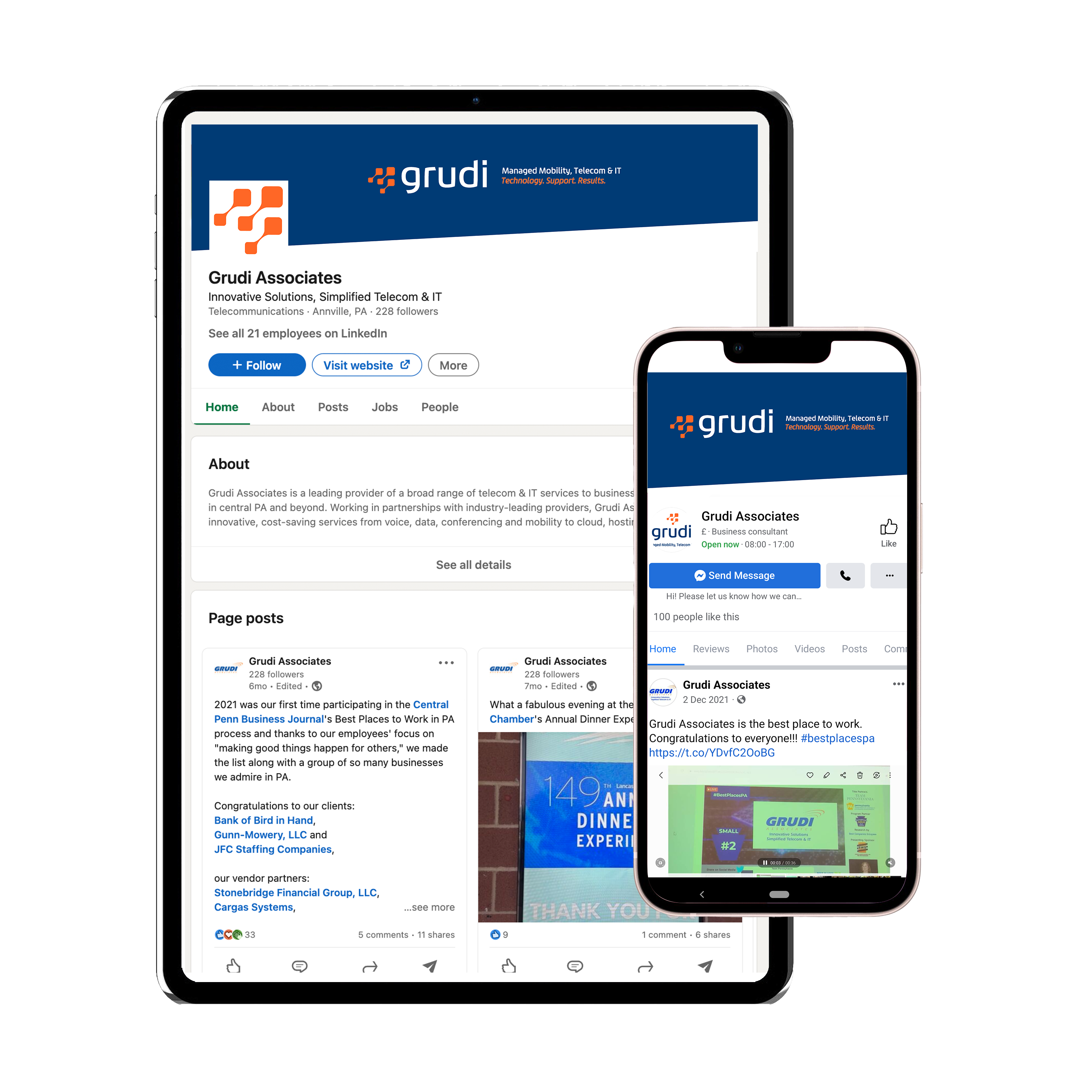
- Updated its branding from “Innovative Solutions, Simplified Telecom & IT” to “Technology. Support. Results.” These are the epicenter of what communications technology businesses need and are seeking.
- Developed a new name that more effectively reflects who Grudi Associates is. The new name is simply “Grudi.” While the change may seem minor, the effect is major. Dropping “Associates” makes it much more current and lends itself better to a high-tech firm. It also helps retain the major amount of goodwill Grudi has developed over the past thirty years.
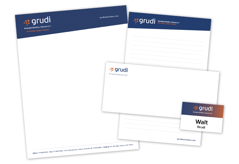
- A new logo was developed that is contemporary, clean and fresh, easy to read and reproduce, techy in nature and is able to stand alone as well as in a lockup.
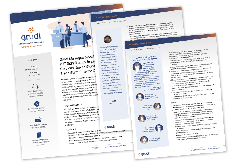
- With the new items in place, a new website was created that much more effectively conveys who Grudi is, what it does and how it benefits its customer. For expediency, the website is being developed in iterations, building on the core, most essential messaging and content over time.
- A DRIP email campaign was developed to stay in front of prospects and reach them with the updated, engaging messaging and content.
- Updating all of Grudi’s communications materials to reflect the new branding and messaging.
The entire Grudi team is elated with its new face and personality. Market feedback and response has been extremely positive.